
Goal
Develop identity guidelines on a creative and innovative way for Cataringa´s brand of moringa powder.
______________
OBJETIVO
Brindar lineamientos para asegurar soluciones creativas y relevantes para un sistema de identidad para la marca de Moringa en polvo, Cataringa.
Develop identity guidelines on a creative and innovative way for Cataringa´s brand of moringa powder.
______________
OBJETIVO
Brindar lineamientos para asegurar soluciones creativas y relevantes para un sistema de identidad para la marca de Moringa en polvo, Cataringa.
ATTRIBUTES TO COMMUNICATE | ATRIBUTOS A COMUNICAR

TARGET
Women 25-44 ABC+C
With children aged 0-11
They have a healthy lifestyle
_______
Women 25-44 ABC+C
With children aged 0-11
They have a healthy lifestyle
_______
Mujeres 25-44 ABC+C
Con niños 0-11 años
Llevan estilo de vida orientado en el bienestar.
Con niños 0-11 años
Llevan estilo de vida orientado en el bienestar.

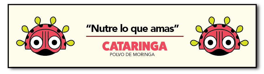
imagotype
It was decided to use create a character making it attractive for kids; nevertheless we thought about retaking the origin of the moringa making reference to a species of African mask but with geometric and complete traces; seeking to respect the origin of the product and the values of the brand. The colors of the isotype seek to draw attention, in addition to properly identifying a catarina. Due to the different look of the moringa leaves, we decided to use green to generate obviousness regarding the color of a leaf in the collective imagination, and the lemon green color helped us to match the idea of natural/nutritious. We seek in our isotype to allude the land, the artisanal and the fun within these concepts, we believe that our character does not fall into the ridiculous or too cartoon and it finds a very good balance between the serious/formal and light, practical and after all, fun.
IMAGOTIPO
Se decidío usar crear un personaje haciendolo atractivo para el niño; sin embargo pensamos en retomar el origen de la moringa haciendo alusión a una especie de mascara Africana pero con trazos geométricos y completos; buscando respetar así el origen del producto y los valores de la marca. Los colores del isotipo buscan llamar la atención, además de identificar propiamente al personaje de la catarina. Debido al carácter distinto de las hojas de moringa, decidimos usar verde para generar obviedad en cuanto al color de una hoja en el imaginario colectivo, además nos ayuda el color verde limón a empatar con la idea de natural/nutritivo. Buscamos en nuestro isotipo aludir a la tierra, a lo artesanal y a lo divertido dentro de estos conceptos, creemos que nuestro personaje no cae en lo ridículo ni demasiado caricaturesco y encuentra un muy buen balance entre lo serio/formal y lo ligero, práctico y sobre todo divertido.

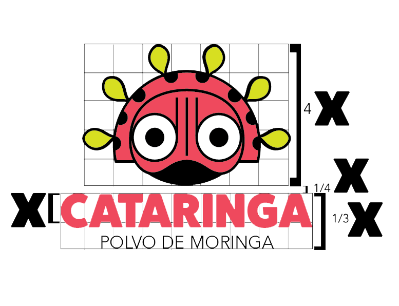
RETICLE | RETÍCULA DE CONTRUCCIÓN
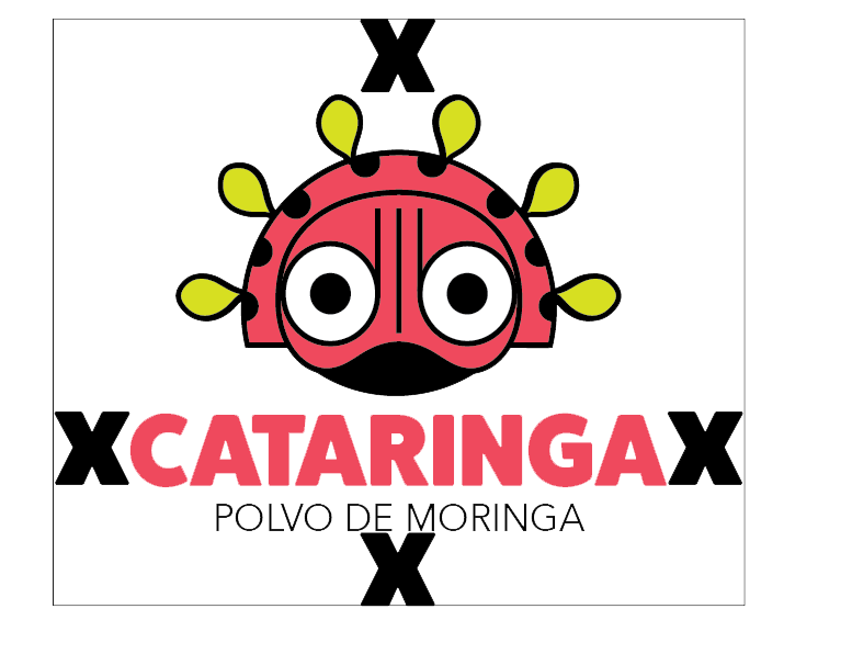
PROTECTION AREA | ÁREA DE PROTECCIÓN
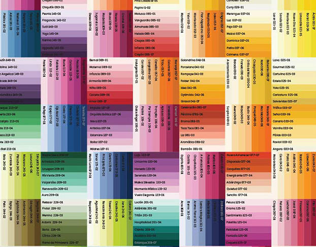
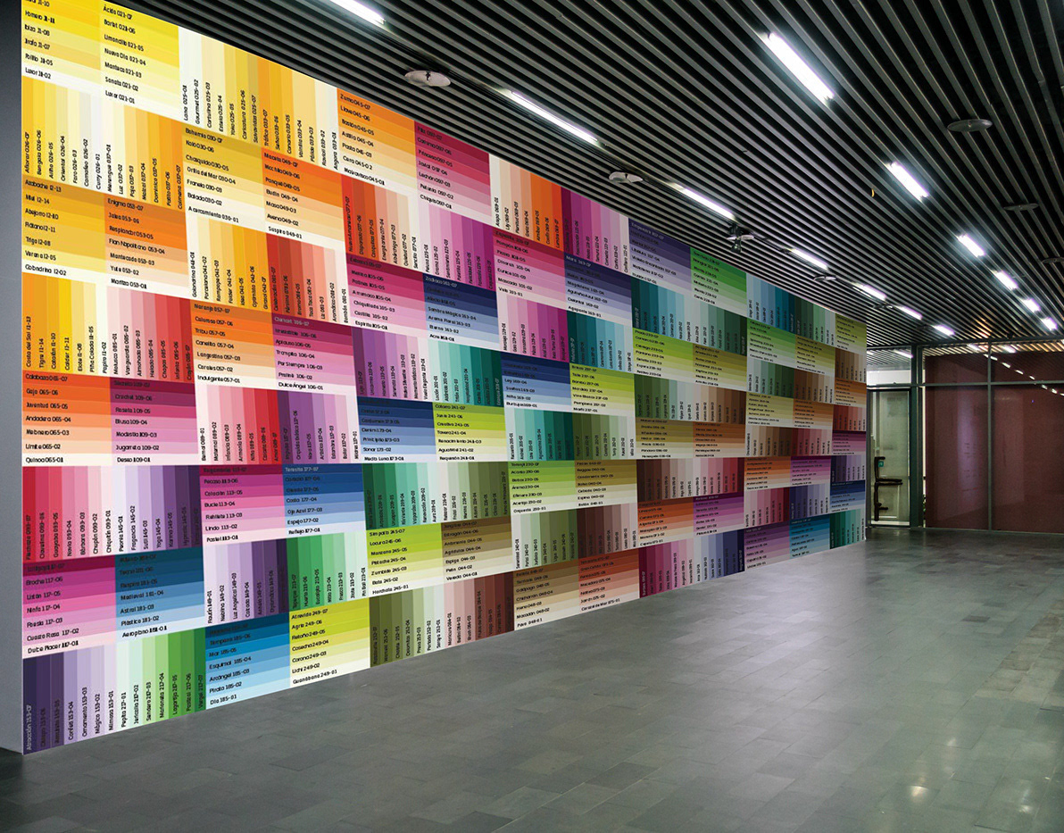
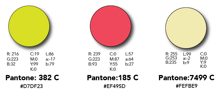
COLOR PALETTE | paleta de color
TYPOGRAPHIES
Fat Frank typography, was chosen for its heaviness, also because of its circular edges, it gave us an idea of infantilism. On the other hand, Avenir seemed like a good balance between the formal / discreet and the modern to us, as complementary typography fulfills its supporting role, looking to use it as a resource that will help us to tell the hard data of the brand, we look for fun in conjunction with light in this typography. In summary, the typographic game that we used in our imagotype seeks to be fun, light and natural, related to the brand identity.
TIPOGRAFÍAS
La tipografía, Fat Frank, que usamos para el logotipo y para algunos textos dentro del empaque fue una tipografía que elegimos por su pesadez, lo cual nos permitiría hacerla un poco más chica, dándole un lugar protagónico al isotipo. Además de su pesadez, la elegimos debido a sus bordes circulares, además de que los ojos pequeños nos dan una idea de infantilismo sin necesariamente caer en redundancias. La tipografía en rojo, junto con los atributos de la misma buscan al igual que el isotipo llamar la atención y que se entienda el papel secundario del logotipo.
Por otro lado, Avenir nos pareció un buen balance entre lo formal/discreto y lo moderno, como tipografía complementaria cumple su papel de apoyo, buscando usarla como un recurso que nos ayudara a decir los datos duros propios de la marca, buscamos en esta tipografía lo divertido en conjunto con lo ligero. En resumen, el juego tipográfico que usamos en nuestro imagotipo busca ser divertido, ligero y natural, en función de la personalidad de la marca.


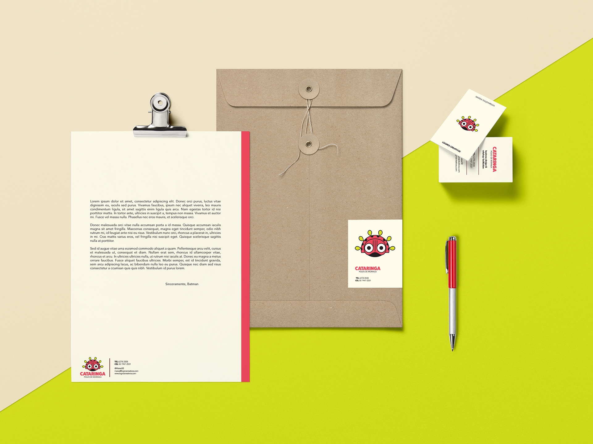
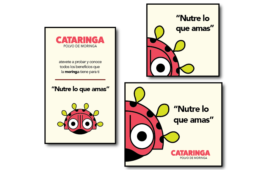
STATIONERY | PAPELERIA
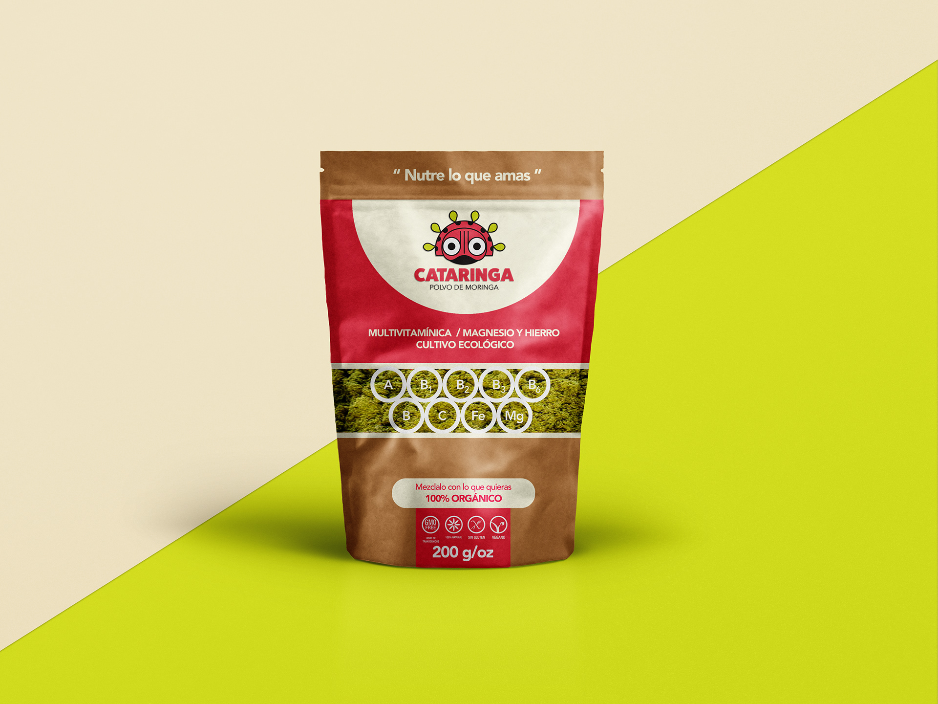
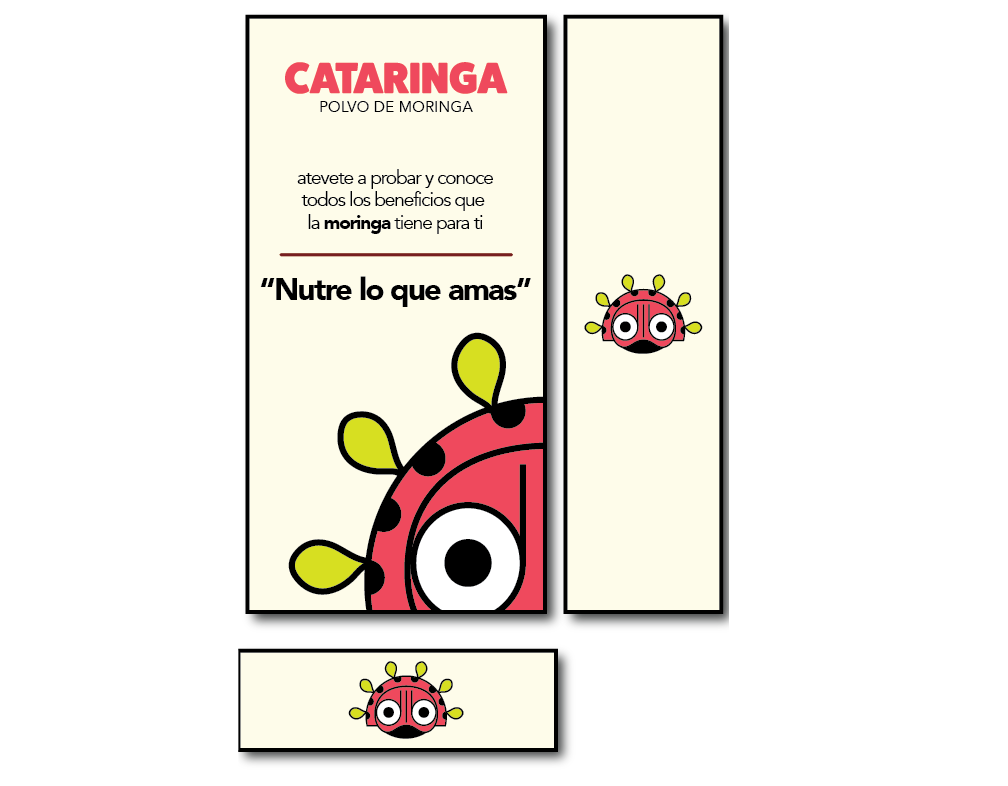
PACKING | EMPAQUE
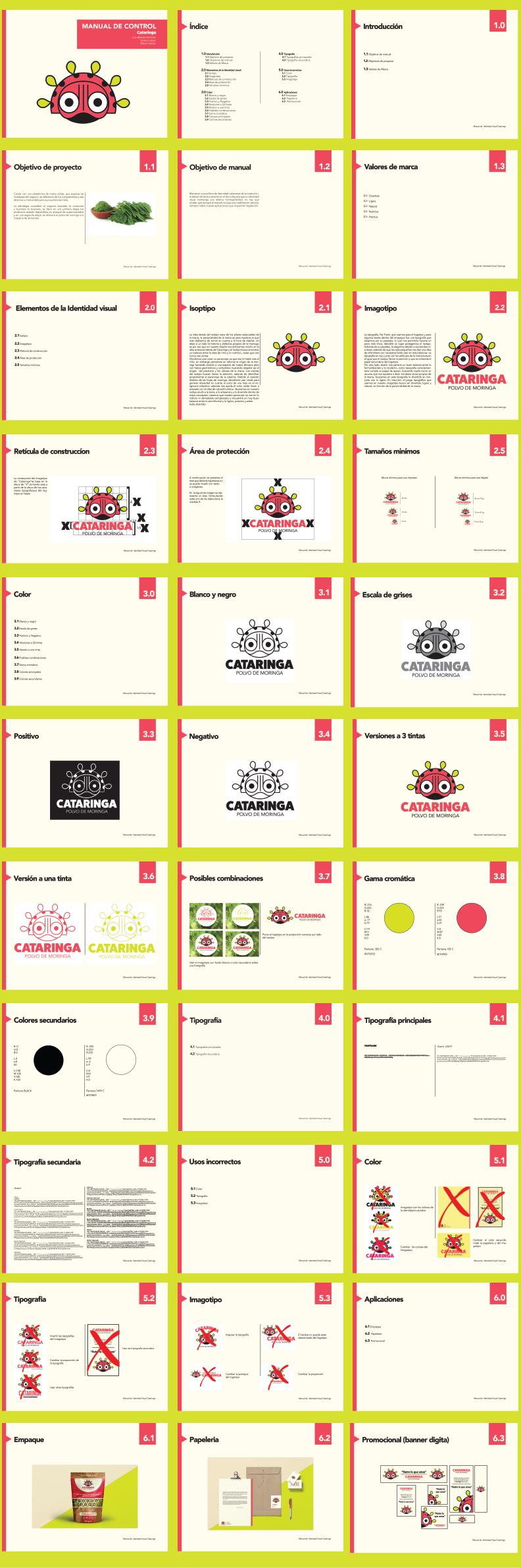
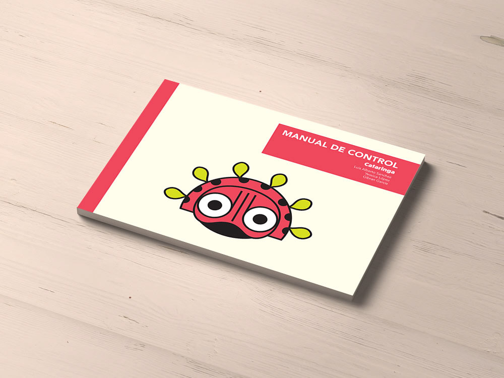
IDENTITY GUIDELINES | MANUAL DE INDENTIDAD
TO PRINT | PARA IMPRESIÓN

BANNERS
Credits
Client -Marea Saldarriaga for Logros Creativos
Advisor - Gabriela García Melas
Creative Director - Cristian Gibran García
Design -Cristian Gibran García, Yessica López, Luis Alberto Sanchez
Client -Marea Saldarriaga for Logros Creativos
Advisor - Gabriela García Melas
Creative Director - Cristian Gibran García
Design -Cristian Gibran García, Yessica López, Luis Alberto Sanchez